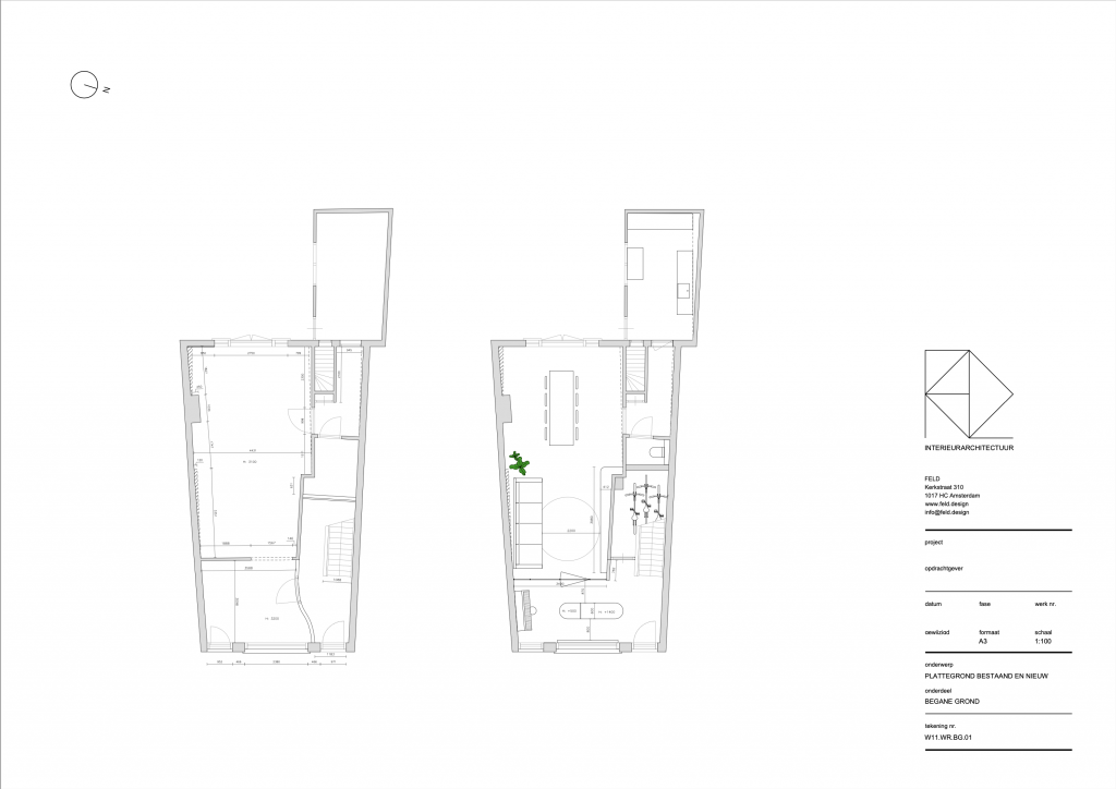
The residents of this monumental house in the center of Amersfoort wanted more light and spaciousness in their home. Based on several layout proposals from FELD, it was chosen which layout best meets this demand.
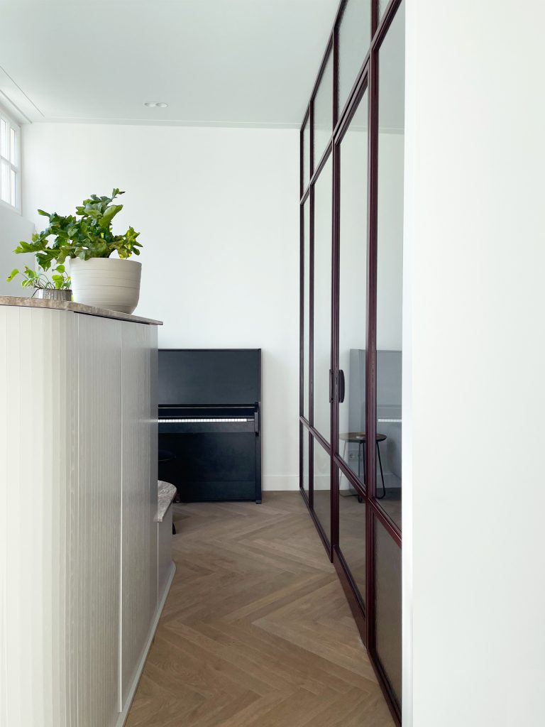
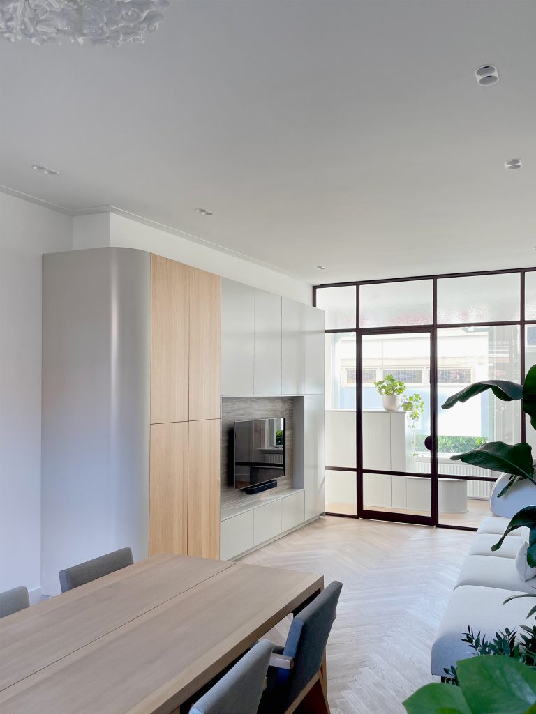
By removing the closed wall towards the hall, light now enters both at the rear and at the front. The glass facade separates the hall from the living area. This way, optimal natural light is let in. Glass parts alternate with parts of semi-transparent decorative glass. The steel of the facade is in a black-red shade to give it a warm appearance.
Sexy storage
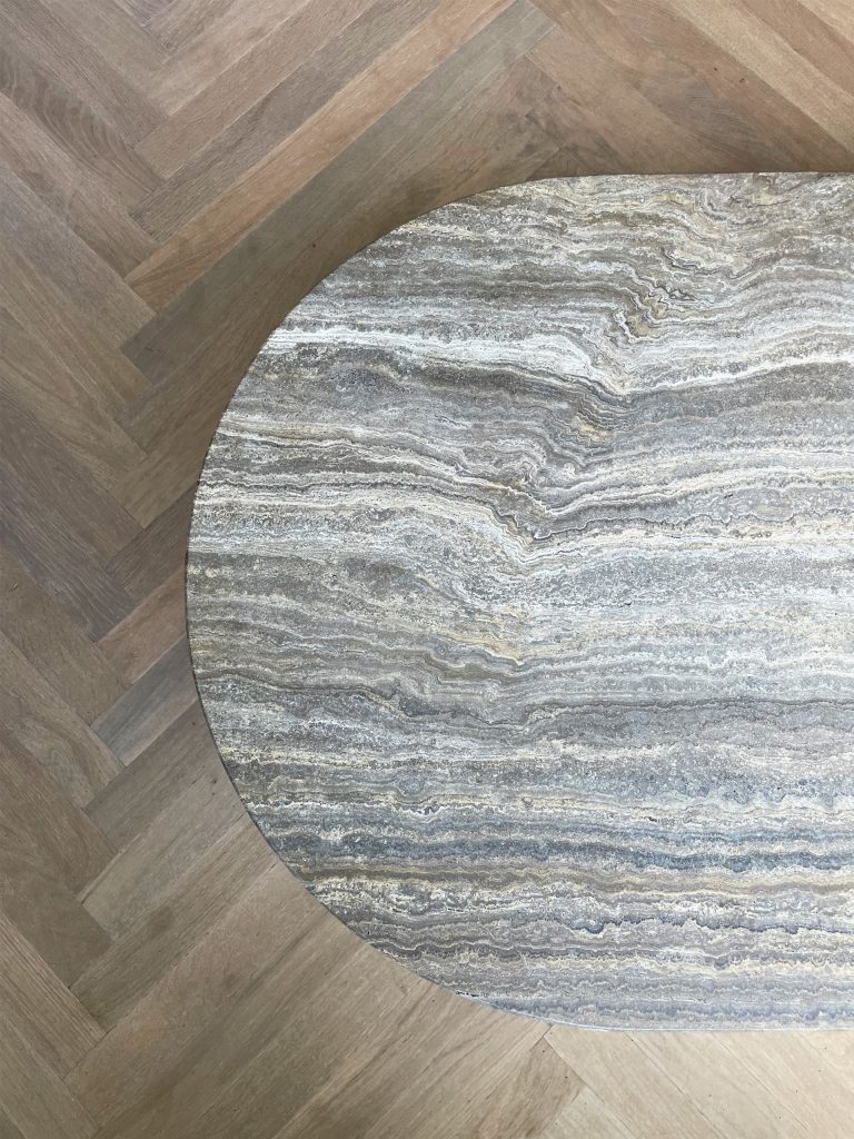
The hall has a half-height wardrobe for coats. You can sit on the lower part and place your shoes in it. The round shapes of the cupboard make the passage around the cupboard pleasant and maintain the spatial feeling. The cabinet is made of very soft gray slats. The vertical lines of the slats reinforce the slender shape of the element. The top of the element is finished with travertine, a beautiful natural stone from Italy.
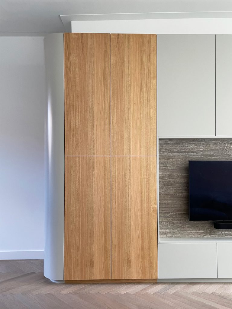
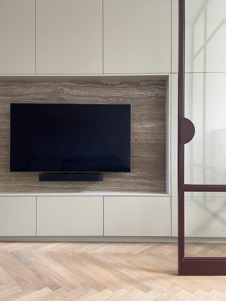
In the living room the family plays games, do crafts and watch TV. By working with a wall unit that offers plenty of storage space and the TV, a neat – and therefore more spacious – living room is easy to achieve. The soft gray color of the wardrobe returns, as does the beautiful natural stone. The living room cupboard has oak parts for a natural touch.
Small adjustment, big difference
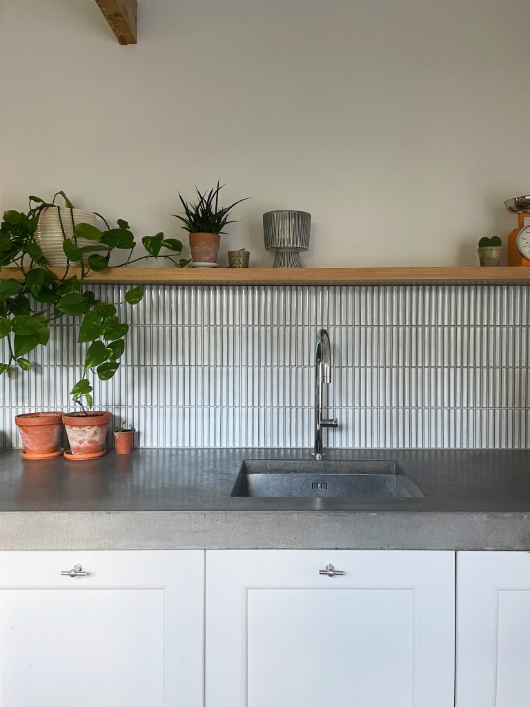
Unlike the living area, the kitchen has not been renovated, but has been refreshed because it still functioned very properly. By adding a light blue, slim wall tile in combination with a warm oak shelve with lighting, the feeling of a new kitchen has been achieved.
